
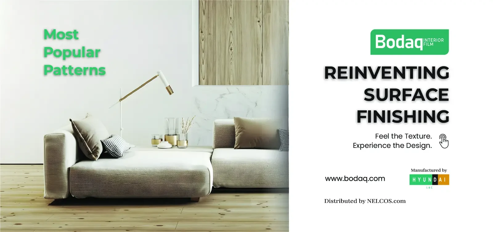
A cover that sells the feeling of the finish
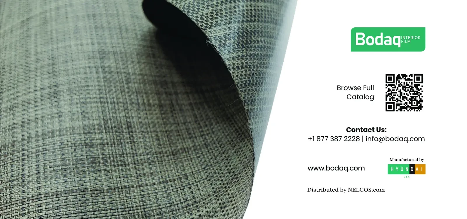
The front cover pairs a warm living room scene with the line “Reinventing Surface Finishing”. The back cover lets buyers feel a real fabric texture and scan a QR code for the full catalogue.
Five finish families, one clear system
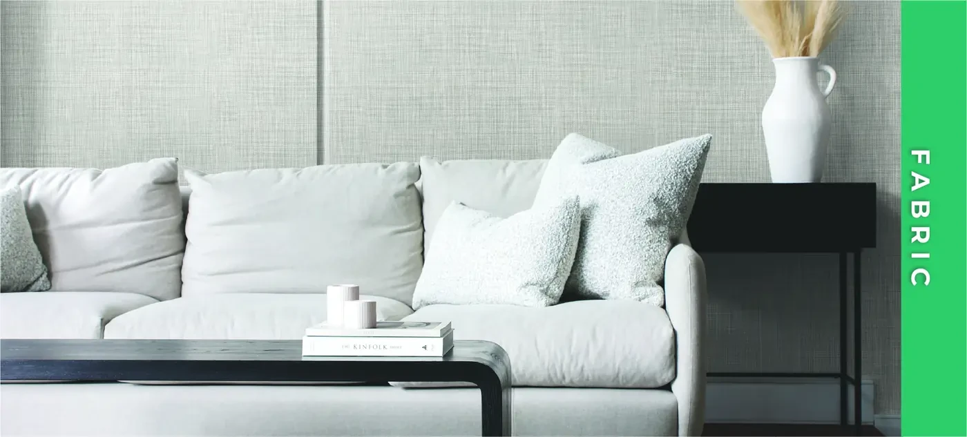
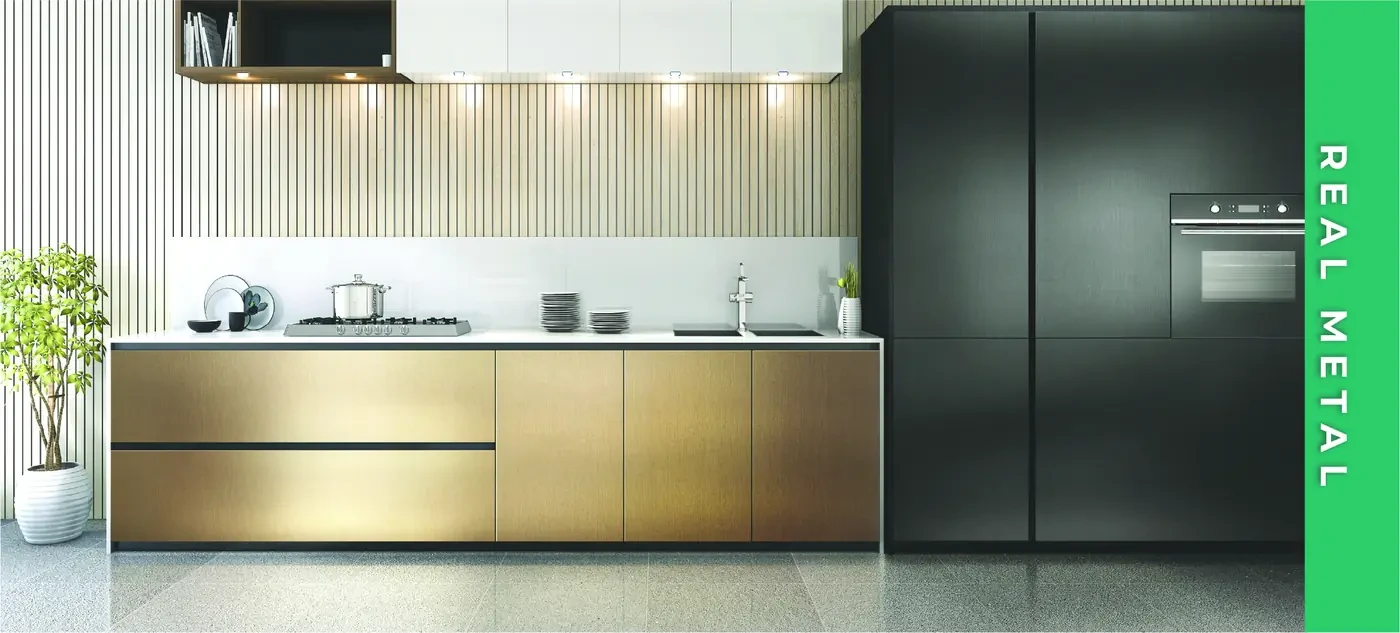
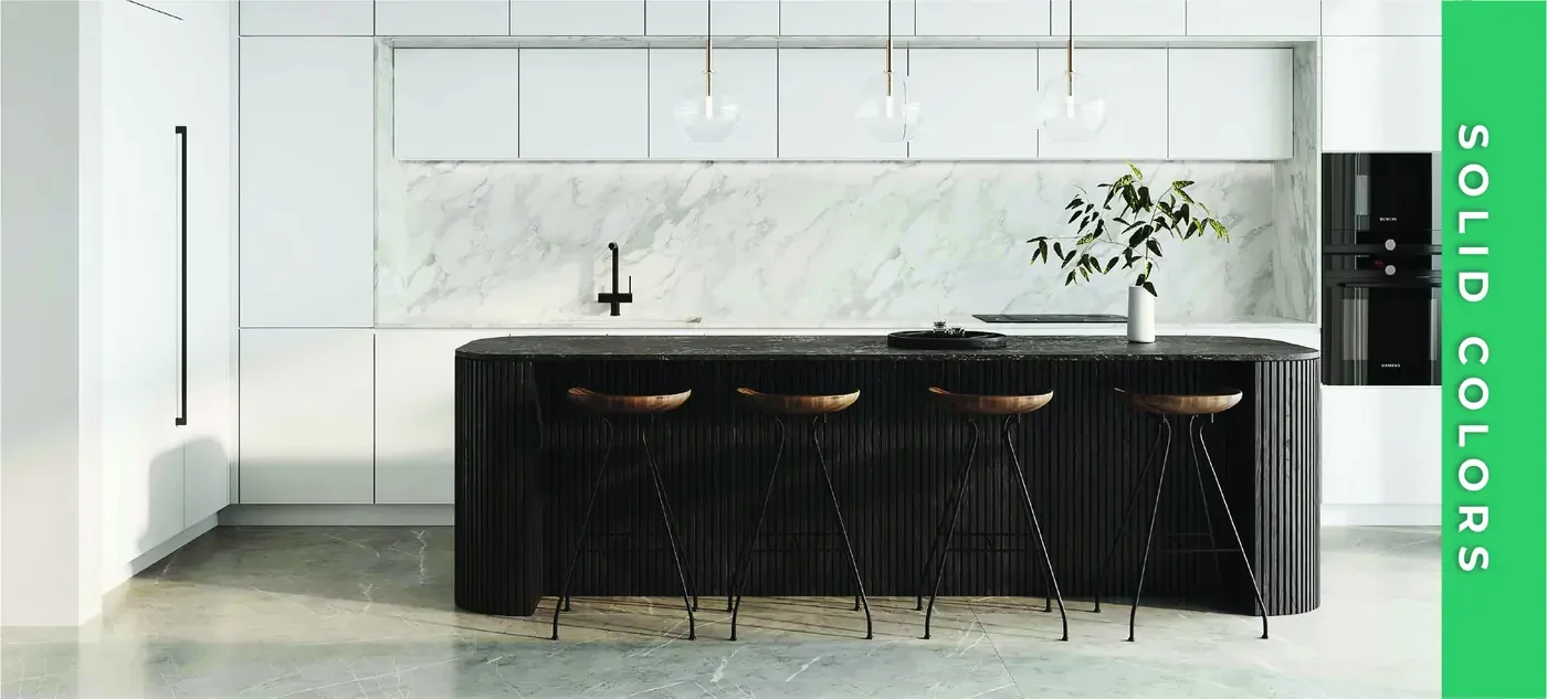
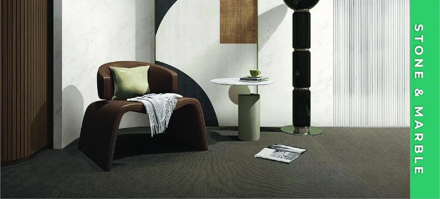
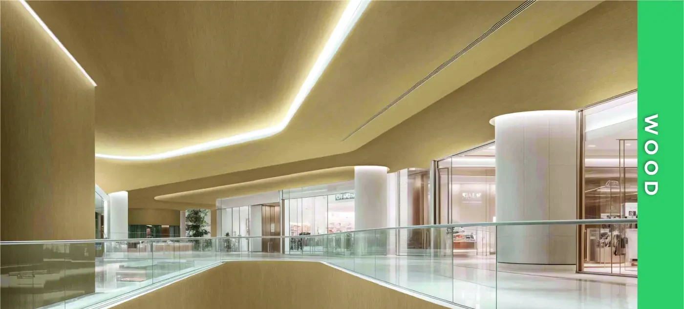
Each divider opens a family of samples with a full-bleed interior photo and a green side tab, so buyers can flip straight to Fabric, Real Metal, Solid Colors, Stone & Marble or Wood.
Booth graphics built to stop people walking past
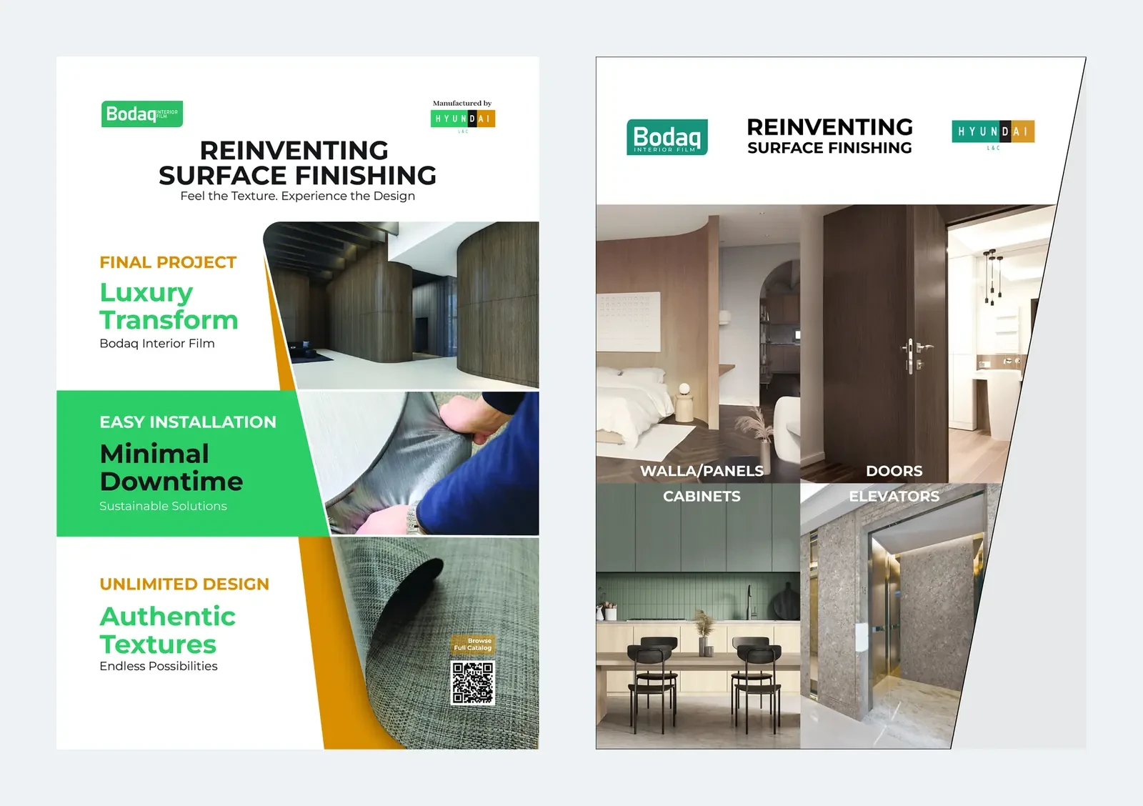
A 1650 × 2400 mm vertical panel tells the product story in three points: luxury transformation, minimal downtime and authentic textures. The side panel shows the four main uses: walls and panels, doors, cabinets and elevators.
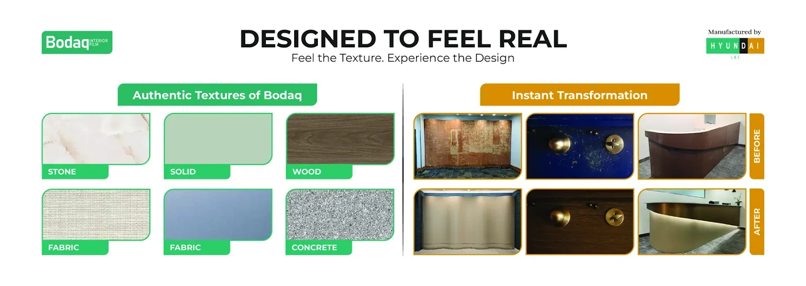
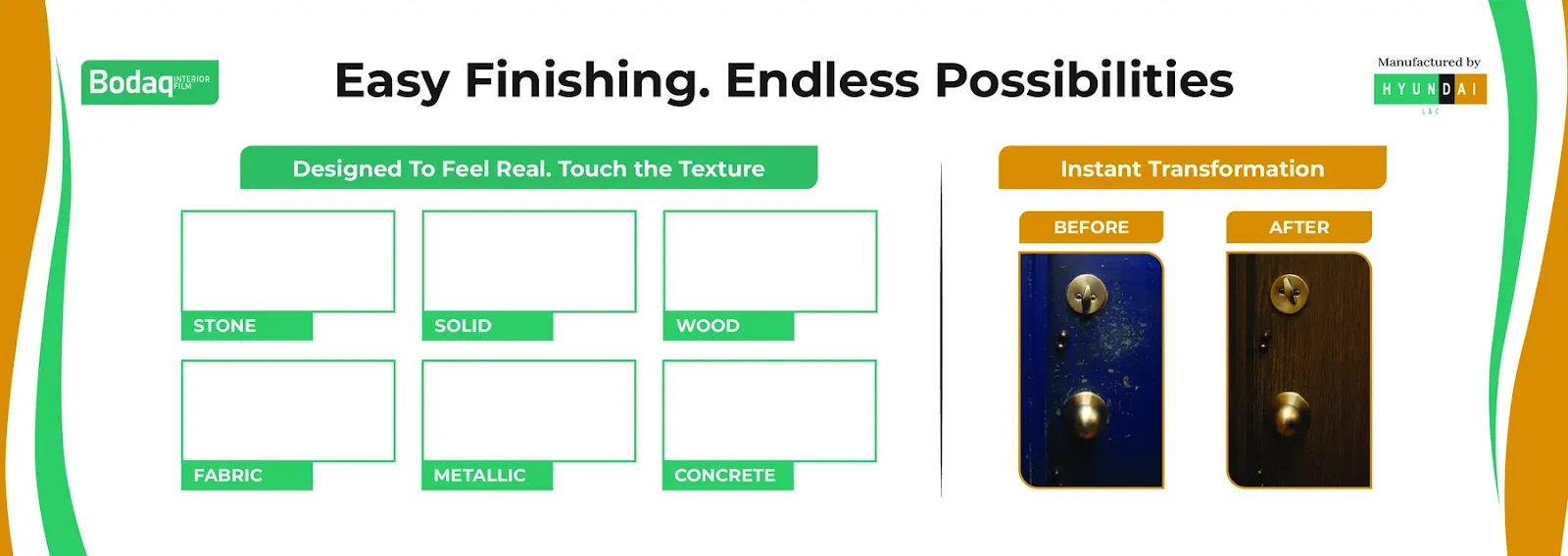
A 2.95-metre banner that lets visitors touch the product
The horizontal banner shows real textures and before-and-after transformations. A second version leaves framed spaces where physical samples are mounted, so visitors can see and touch the film.
“Hamid did an excellent job designing our Swatch Book layout. He is highly skilled, easy to communicate with, and very responsive. We were working under a tight deadline, and he was always willing to help quickly and make any adjustments we requested without hesitation. His flexibility and positive attitude made the entire process smooth and efficient. It was truly a pleasure working with him, and we would gladly work with him again.”Gregorio Mello · Manager, Bodaq