
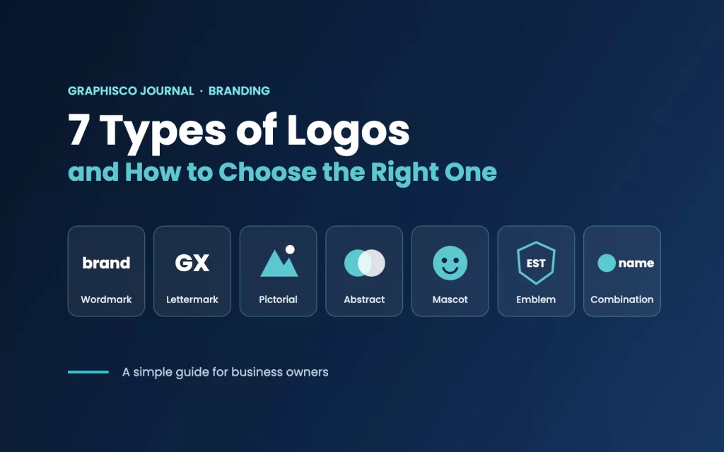
Your logo is often the first thing people notice about your business. It appears on your website, social media, packaging, signboards and business cards, so it needs to be memorable and work everywhere. But not every logo works the same way. Designers group logos into seven main types, and each one suits a different kind of business.
Here is a simple guide to each type, with examples, and how to choose the right one for your brand.
1. Wordmark (logotype)
A wordmark is the business name written in a distinctive font or custom lettering. There is no icon, so the name itself becomes the logo.
Well-known examples: Google, Coca-Cola, FedEx, Visa.
- Best for: new businesses with a short, unique name that you want people to remember.
- Keep in mind: long names can become hard to read, especially at small sizes. Typography choice is everything here.
2. Lettermark (monogram)
A lettermark uses initials or a short abbreviation instead of the full name. It turns a long name into something quick and easy to recognise.
Well-known examples: IBM, HBO, CNN, NASA.
- Best for: companies with long or hard-to-pronounce names.
- Keep in mind: a new business may need to show its full name nearby at first, until people learn what the letters stand for.
3. Pictorial mark (logo symbol)
A pictorial mark is a simple, recognisable image or icon, often related to the brand name or what it does.
Well-known examples: Apple, Twitter’s former bird, Target.
- Best for: brands that want a strong icon for apps, social media profiles and small spaces.
- Keep in mind: on its own, a new icon does not tell people your name. Most new businesses pair it with text first.
4. Abstract mark
An abstract mark is a unique geometric shape or form that does not show a real object. It represents an idea or feeling rather than a picture.
Well-known examples: Nike’s swoosh, Pepsi’s globe, Adidas.
- Best for: businesses that want something completely ownable, or that offer many services and need a flexible symbol.
- Keep in mind: abstract shapes take time to build meaning, so they work best with a clear brand strategy behind them.
5. Mascot
A mascot logo uses an illustrated character to represent the brand. It gives the business a friendly face and a personality.
Well-known examples: KFC’s Colonel, Michelin Man, Mr. Peanut.
- Best for: food brands, kids’ products, sports teams and businesses that want to feel fun and approachable.
- Keep in mind: detailed illustrations can be hard to reproduce small, so most mascot brands also need a simpler version.
6. Emblem
An emblem places the name inside a shape, such as a badge, seal or crest. It feels traditional, established and trustworthy.
Well-known examples: Starbucks, Harley-Davidson, many universities and government bodies.
- Best for: schools, institutions, cafés, and brands that want a classic or heritage feel.
- Keep in mind: fine details can disappear on small screens and printed items, so emblems need careful simplification.
7. Combination mark
A combination mark joins text with a symbol, mascot or abstract mark. The two parts can be used together or separately as the brand grows.
Well-known examples: Burger King, Lacoste, Doritos.
- Best for: most new and growing businesses, because it shows both your name and a recognisable symbol.
- Keep in mind: plan how each part will work alone, for example the icon as a social media profile picture.
How to choose the right logo type
There is no single best logo type. The right choice depends on your business, your audience and where your logo will appear. Ask yourself these questions:
- Is your name short and unique? A wordmark could be enough.
- Is your name long? Consider a lettermark or a combination mark.
- Will your logo appear mostly on apps and social media? A clear symbol helps at small sizes.
- Do you want a friendly, fun personality? A mascot may suit you.
- Do you want to look established and traditional? An emblem can communicate that.
- Are you just starting out? A combination mark gives you flexibility as your brand grows.
A logo is the start, not the whole brand
A great logo works best inside a complete brand identity: the right colours, fonts, logo variations and simple guidelines that keep everything consistent. That is how small businesses start to look as professional as much bigger companies. You can see this approach in our Complitrac brand identity case study, and read more in our article on why your business needs a complete brand identity, not just a logo.
Need help choosing?
At Graphisco, we start every logo project with your business goals, then explore the logo types that fit you best. Explore our brand identity design service, or get in touch for a free consultation.
لوگو کی ۷ اقسام اور اپنے کاروبار کے لیے صحیح لوگو کیسے چنیں
اکثر لوگ آپ کے کاروبار میں سب سے پہلے آپ کا لوگو دیکھتے ہیں۔ یہ آپ کی ویب سائٹ، سوشل میڈیا، پیکجنگ، سائن بورڈز اور بزنس کارڈز پر آتا ہے، اس لیے اسے یادگار ہونا چاہیے اور ہر جگہ اچھا لگنا چاہیے۔ مگر ہر لوگو ایک جیسا کام نہیں کرتا۔ ڈیزائنرز لوگوز کو سات بنیادی اقسام میں تقسیم کرتے ہیں، اور ہر قسم الگ طرح کے کاروبار کے لیے موزوں ہے۔
یہ رہی ہر قسم کی آسان گائیڈ، مثالوں کے ساتھ، اور یہ کہ اپنے برانڈ کے لیے صحیح قسم کیسے چنیں۔
۱۔ ورڈ مارک (لوگو ٹائپ)
ورڈ مارک میں کاروبار کا نام ایک منفرد فونٹ یا خاص لکھائی میں لکھا جاتا ہے۔ اس میں کوئی آئیکن نہیں ہوتا، نام ہی لوگو بن جاتا ہے۔
مشہور مثالیں: گوگل، کوکا کولا، فیڈ ایکس، ویزا۔
- کس کے لیے بہتر: نئے کاروبار جن کا نام مختصر اور منفرد ہو اور جسے آپ لوگوں کو یاد کروانا چاہتے ہوں۔
- یاد رکھیں: لمبے نام پڑھنے میں مشکل ہو سکتے ہیں، خاص طور پر چھوٹے سائز میں۔ یہاں فونٹ کا انتخاب ہی سب کچھ ہے۔
۲۔ لیٹر مارک (مونوگرام)
لیٹر مارک میں پورے نام کے بجائے ابتدائی حروف یا مختصر نام استعمال ہوتا ہے۔ یہ لمبے نام کو جلد پہچانے جانے والی چیز بنا دیتا ہے۔
مشہور مثالیں: آئی بی ایم، ایچ بی او، سی این این، ناسا۔
- کس کے لیے بہتر: وہ کمپنیاں جن کا نام لمبا یا بولنے میں مشکل ہو۔
- یاد رکھیں: نئے کاروبار کو شروع میں پورا نام بھی ساتھ دکھانا پڑ سکتا ہے، جب تک لوگ حروف کا مطلب نہ سیکھ لیں۔
۳۔ پکٹوریل مارک (لوگو سمبل)
پکٹوریل مارک ایک سادہ اور پہچان میں آنے والی تصویر یا آئیکن ہوتا ہے، جو اکثر برانڈ کے نام یا کام سے جڑا ہوتا ہے۔
مشہور مثالیں: ایپل، ٹوئٹر کا پرانا پرندہ، ٹارگٹ۔
- کس کے لیے بہتر: وہ برانڈز جو ایپس، سوشل میڈیا پروفائلز اور چھوٹی جگہوں کے لیے مضبوط آئیکن چاہتے ہوں۔
- یاد رکھیں: نیا آئیکن اکیلا لوگوں کو آپ کا نام نہیں بتاتا۔ زیادہ تر نئے کاروبار شروع میں اسے متن کے ساتھ استعمال کرتے ہیں۔
۴۔ ایبسٹریکٹ مارک
ایبسٹریکٹ مارک ایک منفرد جیومیٹرک شکل ہوتی ہے جو کسی حقیقی چیز کو نہیں دکھاتی۔ یہ کسی تصویر کے بجائے ایک خیال یا احساس کی نمائندگی کرتی ہے۔
مشہور مثالیں: نائیکی کا سووش، پیپسی کا گلوب، ایڈیڈاس۔
- کس کے لیے بہتر: وہ کاروبار جو مکمل طور پر اپنی ملکیت والی علامت چاہتے ہوں، یا کئی سروسز دیتے ہوں اور لچکدار علامت کی ضرورت ہو۔
- یاد رکھیں: ایبسٹریکٹ شکلوں کو معنی بنانے میں وقت لگتا ہے، اس لیے یہ واضح برانڈ اسٹریٹجی کے ساتھ بہترین کام کرتی ہیں۔
۵۔ میسکوٹ
میسکوٹ لوگو میں ایک تصویری کردار برانڈ کی نمائندگی کرتا ہے۔ یہ کاروبار کو ایک دوستانہ چہرہ اور شخصیت دیتا ہے۔
مشہور مثالیں: کے ایف سی کے کرنل، مشلن مین، مسٹر پینٹ۔
- کس کے لیے بہتر: فوڈ برانڈز، بچوں کی پروڈکٹس، اسپورٹس ٹیمیں اور وہ کاروبار جو مزے دار اور قریب محسوس ہونا چاہتے ہوں۔
- یاد رکھیں: تفصیلی تصاویر چھوٹے سائز میں مشکل ہوتی ہیں، اس لیے زیادہ تر میسکوٹ برانڈز کو ایک سادہ ورژن بھی چاہیے ہوتا ہے۔
۶۔ ایمبلم
ایمبلم میں نام کسی شکل کے اندر ہوتا ہے، جیسے بیج، مہر یا کرسٹ۔ یہ روایتی، مستحکم اور قابل اعتماد محسوس ہوتا ہے۔
مشہور مثالیں: اسٹاربکس، ہارلی ڈیوڈسن، کئی یونیورسٹیاں اور سرکاری ادارے۔
- کس کے لیے بہتر: اسکول، ادارے، کیفے اور وہ برانڈز جو کلاسک یا روایتی تاثر چاہتے ہوں۔
- یاد رکھیں: باریک تفصیلات چھوٹی اسکرینز اور پرنٹ شدہ چیزوں پر غائب ہو سکتی ہیں، اس لیے ایمبلم کو احتیاط سے سادہ بنانا پڑتا ہے۔
۷۔ کمبی نیشن مارک
کمبی نیشن مارک متن کو کسی علامت، میسکوٹ یا ایبسٹریکٹ مارک کے ساتھ جوڑتا ہے۔ برانڈ بڑھنے کے ساتھ دونوں حصے اکٹھے یا الگ الگ استعمال ہو سکتے ہیں۔
مشہور مثالیں: برگر کنگ، لاکوسٹ، ڈوریٹوس۔
- کس کے لیے بہتر: زیادہ تر نئے اور بڑھتے ہوئے کاروبار، کیونکہ یہ آپ کا نام اور ایک پہچانی جانے والی علامت دونوں دکھاتا ہے۔
- یاد رکھیں: پلان کریں کہ ہر حصہ اکیلا کیسے کام کرے گا، مثلاً آئیکن بطور سوشل میڈیا پروفائل تصویر۔
صحیح لوگو کی قسم کیسے چنیں
کوئی ایک بہترین لوگو قسم نہیں ہوتی۔ صحیح انتخاب آپ کے کاروبار، آڈینس اور اس جگہ پر منحصر ہے جہاں لوگو نظر آئے گا۔ خود سے یہ سوال پوچھیں:
- کیا آپ کا نام مختصر اور منفرد ہے؟ ورڈ مارک کافی ہو سکتا ہے۔
- کیا آپ کا نام لمبا ہے؟ لیٹر مارک یا کمبی نیشن مارک پر غور کریں۔
- کیا لوگو زیادہ تر ایپس اور سوشل میڈیا پر آئے گا؟ چھوٹے سائز میں واضح علامت مدد دیتی ہے۔
- کیا آپ دوستانہ اور مزے دار شخصیت چاہتے ہیں؟ میسکوٹ آپ کے لیے موزوں ہو سکتا ہے۔
- کیا آپ مستحکم اور روایتی نظر آنا چاہتے ہیں؟ ایمبلم یہ تاثر دے سکتا ہے۔
- کیا آپ ابھی شروعات کر رہے ہیں؟ کمبی نیشن مارک برانڈ بڑھنے کے ساتھ لچک دیتا ہے۔
لوگو آغاز ہے، پورا برانڈ نہیں
بہترین لوگو مکمل برانڈ آئیڈینٹیٹی کے اندر سب سے اچھا کام کرتا ہے: صحیح رنگ، فونٹس، لوگو کے مختلف ورژن اور سادہ گائیڈ لائنز جو سب کچھ یکساں رکھیں۔ اسی طرح چھوٹے کاروبار بڑی کمپنیوں جتنے پروفیشنل نظر آنے لگتے ہیں۔ آپ یہ طریقہ ہماری کمپلی ٹریک برانڈ آئیڈینٹیٹی کیس اسٹڈی میں دیکھ سکتے ہیں، اور ہمارا مضمون آپ کے کاروبار کو صرف لوگو نہیں، مکمل برانڈ آئیڈینٹیٹی کیوں چاہیے پڑھ سکتے ہیں۔
انتخاب میں مدد چاہیے؟
گرافسکو میں ہم ہر لوگو پراجیکٹ آپ کے کاروباری مقاصد سے شروع کرتے ہیں، پھر وہ لوگو اقسام آزماتے ہیں جو آپ کے لیے بہترین ہوں۔ ہماری برانڈ آئیڈینٹیٹی ڈیزائن سروس دیکھیں، یا مفت مشورے کے لیے رابطہ کریں۔